SplendidStorySample – Designer/”ColorMaven”
A seasonal feature profiling color maven Kate Smith of sensationalcolor.com shows how sharing insights and advise in a lively editorial format can showcase a skilled professional’s expertise, expand a reputation and build a client base. For some “conversation starters” and ideas about how our SplendidStories program can put the spotlight on your organization, click HERE.
 COURAGEOUS WITH COLOR
How vibrant, sensational shades
help beat the blahs
by Elaine Rogers
As the Earth sleeps, blanketed by the travails of icy weather, it’s easy to let daily blasts of brittle air and barren landscapes create a bleak outlook as we bundle up, hunker down and solemnly endure the dark days of winter. Muddy skies and hard rains can dampen spirits as well, but designers say passively waiting for the clouds to part is no way to live your life.  A better strategy is to ward off the blahs that gloomy weather inspires with interiors awash in vivid hues, taking refuge in bright spaces designed to lift moods faster than a warm, spring day.
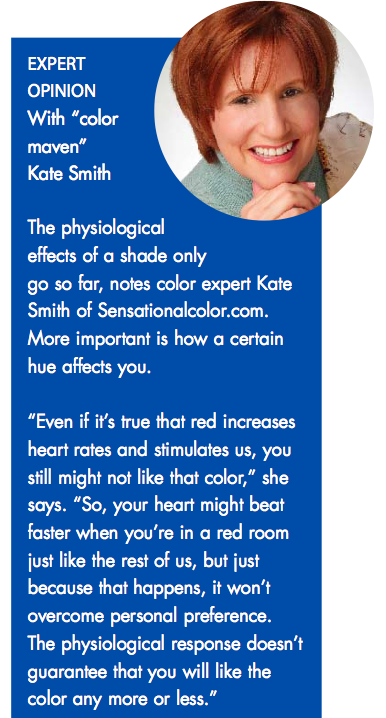
“Color is powerful,” says designer Kate Smith, founder of Sensationalcolor.com and a self-described “color maven.” “It’s the essence of emotion. Whether you see a certain color in a positive or negative light, it’s highly emotive.”
Psychologists and color designers agree that color is one of the biggest influences on the human state of mind and our language regularly references this emotive connection. We “see red,” we’re “green with envy” and life feels “peachy.” Retailers carefully package their products in colors selected to make us buy. And in commercial settings from restaurants to hospitals, color specialists use various wall colors to inspire desired emotions and behaviors. Red stimulates the appetite; pastel blues and greens calm and soothe the soul.
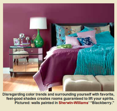
On your own turf, Smith says there’s only one way to approach color: “Go with your gut,” she advises. “There are no hard and fast rules about how to integrate color into your home. There’s a lot of information out there about the psychology of it and how certain hues affect us, and that’s fun, but all that really matters is what you like and the importance of surrounding yourself with what makes you feel good. Color is a huge part of that.”
POPULAR PALETTES
In trend-conscious home environments, neutral tones are still dominant, only they’ve taken on an expanded palette. Smith says the latest hues are deeper and more versatile than earlier versions. Newer shades such as soft peach and blush pink have appeared in the mix, and blending shades like sage green, buttercup or warm gold are showing staying power as versatile accent colors.
“The newer neutrals are more complex and almost hard to describe, like greenish grey and brownish purple,” she explains. “They span all the hues. We’ve got something like 36 shades of grey now, with tones like lavender, blue and green. You can always find one that will work with any other color.”
Inspired by the environmental movement and showing lasting appeal, earth tones evoke thoughts of outdoor elements like stones, pebbles and even bamboo. A newer version of builder beige is “greige,” a fusion of grey and beige.
RICH AND STRONG
A rediscovered classic in both fashion and paint fields, brown has been dubbed “the new black” in some circles. The dark, purple-infused browns Smith mentions have also impacted the marketplace and owe inspiration to the popularity of dark, exotic woods in furnishings and décor.
A surge of nature-inspired tones such as earthy browns, deep floral tones, foliage greens and ocean blues all point to a back-to-basics environmental trend, and experts attribute the abundance of colors drawn from nature to a societal need for balance given the frenetic pace of modern life.
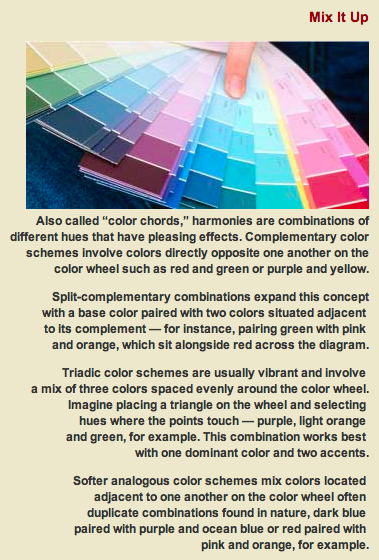
Vibrant color contrasts make a statement in smaller spaces like a children’s playroom or a powder bath, but design theory trendy notes that “colors of the day” shouldn’t be thrown together haphazardly. Violet and lime green, for instance, may seem like a wild mix, but they work well together because they are complementary colors — positioned opposite each other on the color wheel. Turquoise and red-orange are also complementary, while orange and fuchsia, two hues you might think would clash, blend well because they are adjacent on the color wheel, creating a “color harmony.”
TONING IT DOWN
Bold colors are best confined to spaces with less usage, like hallways and small powder baths. In spaces that invite tarrying, brighter choices can be toned down with glazes and colorwashes.
“There are all sorts of variations of any given hue and more ways to mute it or lighten it,” Smith says. For instance, a glaze on a bright red dining room may change its vibrancy to a burnished effect, and bright yellows applied over a white base provide a softer shade. Such texturizing retains the original character of the color while muting its brightness. Colors may also be layered for unusual effects.
Yellow and orange are linked with energizing effects of the sun, making them cheerful options for breakfast areas and kitchens — spaces where your energy might need a boost. Orange in a toned- down terracotta form can be ideal in a home office, as it combines the effects of red and orange but isn’t so emotive as to prevent you from lingering or getting your work done.
BEAUTIFUL BLENDS
Working with a nonprofit organization called Color Marketing Group in Alexandria, Va., Smith is a member of a select set of experts who forecast color trends and says many people like to follow “dictates of fashion” in designing their color schemes. However, she also says trends aren’t meant to be followed mindlessly. “The key to making it work for you is to pull in a new tone and make it your own by mixing it with something you really like and have always liked,” she notes.
If you worry about having an outdated color scheme, it’s simple enough to update with small accent colors. Subtle, muted wall colors like taupe and off-white are easy to live with and can be brightened up with updated accessories and upholstery highlights. Colorful rugs, bright ceramics, vivid prints or paintings and various cushions with sparkles and jewel tones add flashes of color to an otherwise bland room.
LASTING APPEAL
Promoting the notion of trusting your own preferences or “color timbre,” Smith says many of us embrace our “signature colors” almost unintentionally. “I don’t think people should worry too much about the latest trends as much as what appeals to them,” she explains. “It’s like comfort food. It’s nice to surround ourselves with what we like and what have always been feel-good colors to us. … And when you see something new that calls out to you, you’ll know that, too.”
This happened to her recently when she spotted a newer “almost textured” tone of turquoise that looked different in varying lights. Smith says she immediately went home and changed her computer’s home page to a facsimile of it. “Turquoise has always been one of my signature colors,” she says. “But seeing that new version of it just brought that all home.”
For more information and details about our SplendidStories program, click HERE.
And for some inspiration and “conversation starters” to help you decide what kind of SplendidStory advertorial would work best on your website or in collateral materials, click HERE.
* * * * * * *
Click HERE and we can get started today TELLING YOUR TALE and developing the perfect SplendidStory advertorial for you and your website or collateral materials.
* * * * * * *
Need someone to “walk you through the process” of showing people what YOU know and putting your name on everybody’s lips? Contact us for assistance.
Call SplendidlySaid at 972-965-7947 or email Elaine Rogers at erogers@splendidlysaid.com.
Let’s discuss about how you can be sure that remedies you buy through a mail-order drugstore are foolproof. There are hundreds of dependable internet drugstores that will deliver medicines to your address. Many drugstores offer to their customers Kamagra. Kamagra is a preparation used to treat few infections. What do you already know about viagra wikipedia? What consumers talk about generic viagra wiki? The most significant factor you must look for is how long does it take viagra to work. A overall sexual complaint among men is the erectile malfunction. What are the symptoms of sexual diseases? Like all medications, Kamagra have numerous unwanted effects. Together, you and your health care provider can decide if Kamagra or another remedy is right for you.

 Check out our FAVORITE FEATURES